The AHS Blog
The typography of revival watches
This post was written by Mat Craddock
Until recently, there had been little research carried out on the typography of wristwatch dials. However, over the past decade, the increased interest in collectable vintage wristwatches appears to have sparked the interest of brands and collectors alike.
While wristwatch collectors’ focus has largely been on the variations in logo, layout and content of vintage wristwatch dials, interdisciplinary designer Lee Yuen-Rapati has taken a critical look at the typefaces used, and typographic decisions made, by watchmakers.
His Masters dissertation, titled ‘Motivating Factors In The Trends Of Horological Typography,’ formed the basis of an AHS Wristwatch Group talk at The Clockworks in April.
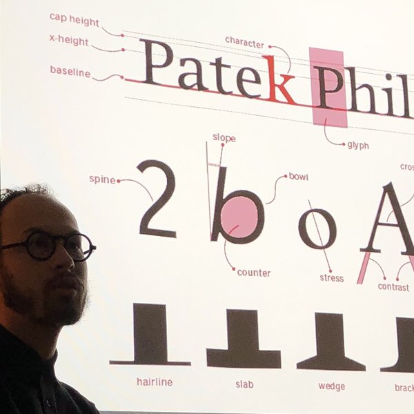
Lee’s research covered clocks, pocket watches and wristwatches, and looked at type and numerals used on the dials, identifying various themes and typographic pitfalls that appeared to be specific to wristwatches.
His research included interviews with brands and independent watchmakers about their typographical decisions, the typefaces they use and the importance of type design to their brand.
His talk focused on the typography of contemporary wristwatches that had revived distinct vintage or antiquarian styles.
Highlights included the use of system (or default) fonts by high end watch manufacturers, the technical limits of pad printing, the benefits and traps of modern processes involved in dial design (such as the digital workspace) and inconsistent choices made by watch brands when reviving older designs. Examples of recent wristwatches from Longines, Nomos and Stowa were used to illustrate these themes.
As a codicil, Lee discussed recent advances in dial printing, such as the use of physical vapour deposition on the zirconium ceramic dials of the Charles Frodsham Double Impulse Chronometer, suggesting that this technology might be taken up by other watch manufacturers, necessitating an increased focus on typographical principles and design choices.
Follow The AHS on Instagram: @thestoryoftime
Lee Yuen-Rapati: @onehourwatch
Mat Craddock: @the_watchnerd