The AHS Blog
The universe on our bench
This post was written by Tabea Rude
My colleague Amélie Bezárd and I had the chance to take a very close look at a so-called ‘Chronoglobium’ invented and built by Mathias Zibermayr in the first half of the 19th century in Brno (today’s Czech Republic) and Graz (Austria).
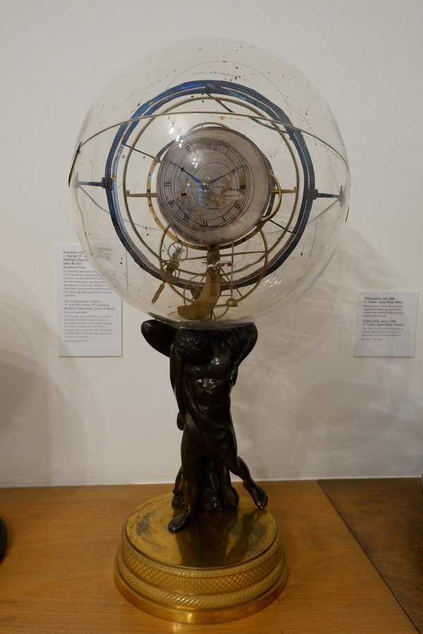
His invention, a terrestrial globe driven by a gear train including small models of the Sun and Moon within a static glass celestial globe, was intended as a teaching device to demonstrate the movements of the heavenly bodies.
Zibermayr built at least 18 of these machines, which enjoyed great popularity not just at the time, but also much later when this particular model entered the Vienna Clock Museum in 1951. Almost immediately, it appeared in the Vienna newspapers and on the museum catalogue cover page.
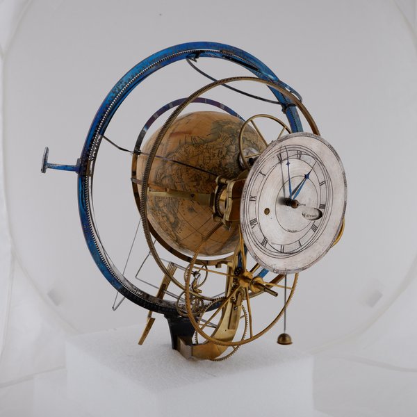
The machine can either be operated using a hand crank to show the movements as a time-lapse, or by a spring-driven clock movement, which also shows the time of day and day of the week.
Within the glass sphere, the shadow-hoop with ecliptic stands vertically, screwed into the back of the supporting Atlas figure. The outer hoop is fixed and shows the day of the month indication. The inner ecliptic is a gear wheel that is firmly attached to the models of Sun and Moon.
These models are attached on long arms on the rear side of the Chronoglobium. The model Sun is firmly attached on the ecliptic with a fan-like grid indicating the direction of Sun rays onto Earth.
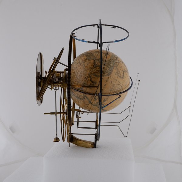
The model Moon is moved by way of a mechanism including two wheels and two lever arms up and down to demonstrate the elliptical movement of the Moon in relation to the Earth. The models of Moon and Sun perform a whole rotation around the terrestrial globe once a ‘year’, indicated by the moving ecliptic.
A few examples of contemporary typography in watchmaking
This post was written by Lee Yuen-Rapati
The evolution of typography in horology has come a long way from the dominance of Roman numerals and the round hand script. While the mid-twentieth century remains a potent library of inspiration for today’s watch brands, other watchmakers look forward in creating their timepieces.
These contemporary watches can appear non-traditional or even avant garde, with typography to match. However a closer look reveals that even the newest typography on watches still has connections to the past.
The use of bold and blocky sans-serif numerals is a common trend in many contemporary watches that try to eschew a sense of antiquity, at least on the surface. A prime example is the collection from Urwerk who have consistently used a bold and angular style of numerals since their inception in the late 1990s. The ultra high-end pieces from Greubel Forsey also feature rather rectangular numerals which both match the aesthetics of their main collection, but provide an interesting juxtaposition in their Hand Made 1 as well as the Naissance d’une Montre (1) watch, both of which highlight more traditional watchmaking techniques.
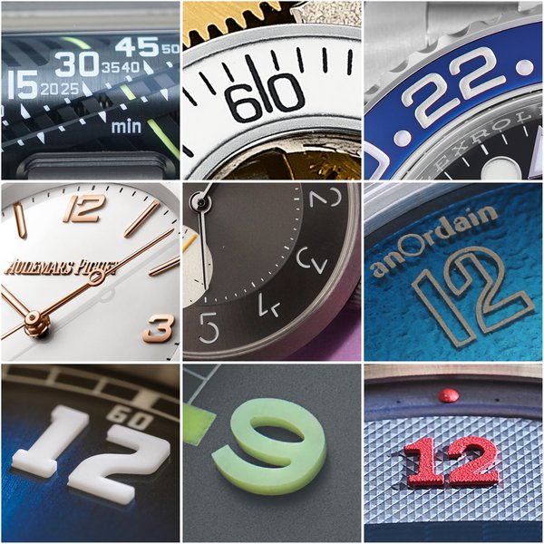
The use of bold and blocky numerals is more of an evolution for a company like Rolex who have adopted them across their recent collection, notably on the Explorer and GMT-Master II models. While none of the examples above are likely to be mistaken for antique pieces, similar rectangular or blocky numerals were popular in the art deco era and into the mid-twentieth century. Even if the watch is new, the link to the past is sometimes quite prominently promoted as with the unabashedly contemporary (and divisive) Code 11.59 collection which features numerals adapted from a 1940s Audemars Piguet minute repeater.
Some contemporary watches pull from outside the horological world to define themselves. Hermès as well as the young company anOrdain each sought out type designers to create new and identifiable typography. Hermès got its modernist numerals from the studio of Philippe Apeloig for its Slim d’Hermès line while anOrdain’s typographer Imogen Ayres created numerals inspired by survey maps. Neither brands’ numerals are completely new, but their lack of typographic precedence in the watch world make them both stand out.
Other brands use more traditional numerals but change the material in order to place their watches firmly in the twenty-first century. H. Moser & Cie’s Heritage Centre Seconds Funky Blue uses applique numerals that are inspired by 1920s pilot’s watches. The appliques are made from the luminous material Globolight rather than metal. In a similar fashion, the refounded British brand Vertex uses moulded Super-LumiNova numerals in lieu of traditionally painted or printed numerals on their military-inspired watches. Kari Voutilainen offers the option for brightly coloured arabic appliques on his watches which bring a youthful presence to his more classically designed dials. Dimensionality has long been a useful styling tool for watchmakers, and the inclusion of new materials has produced some very refreshing results.
The examples above represent a few different typographic paths for the contemporary watchmaker to follow. While these watches and their typography may appear to share very little with antiquity, there are always links to trace back, they are simply being shown from a new angle.
Photo credits:
- Baruch Coutts @budgecoutts (Urwerk, UR-UR111C)
- Greubel Forsey (Hand Made 1)
- Atom Moore @atommoore (Rolex, GMT Master II)
- Audemars Piguet (Code 11.59 Selfwinding White)
- Baruch Coutts (Hermès, Slim D’Hermès Titane)
- AnOrdain (Model 2 Blue Fumé)
- H Moser & Cie (Heritage Centre Seconds Funky Blue)
- Vertex (M100)
- Atom Moore (Voutilainen, TP1 OW2019)
A bad time in Znojmo
This post was written by James Nye
In my January 2021 London Lecture on Johann Antel (1866–1930), the Czech/German clockmaker (available to AHS members here), I condensed much, and stories were omitted, like this one–a disastrous episode.
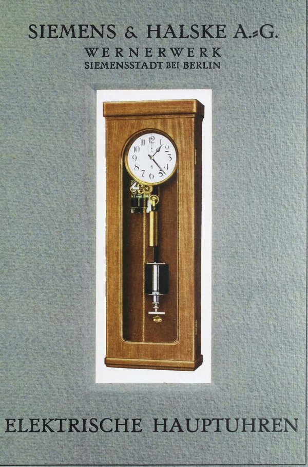
In 1930, the Znojmo authorities sought quotations for a clock for the bus-stop in Divišovo Square. Antel himself died that July, but his firm won the tender, offering a four-sided rooftop subsidiary clock, driven by a minute-impulse transmitter clock. Antel would source it from Siemens and Halske of Berlin, or its Prague subsidiary Elektrotechna.
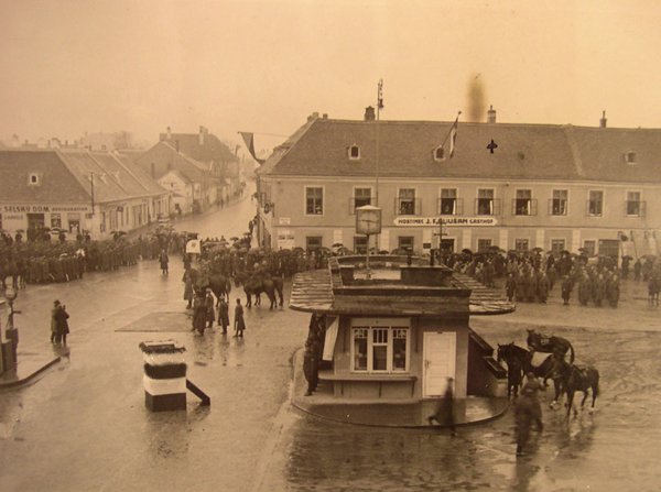
Installation started in February 1931. In lifting the clock housing onto the bus-stop roof, the ladder slipped and both technician and clock fell to the pavement. Six weeks were lost in repairs. It was finally installed 24 March 1931. But regular attendance by the technicians over the next month suggests all was not right from the beginning.
Antel’s widow Ludmilla issued proceedings to secure payment, but matters dragged into 1932. The legal papers are actually a wonderful source of information on this catastrophic installation. The original drawings showed dials with numerals, but Antel’s firm delivered a clock with four plain dials, claiming they looked more ‘modern’.
No! said the town, we want numbers!
They also wanted a thicker gauge of glass, as the night-time illumination revealed too much of the motion-works, and the lamps were so bright the hands were invisible. A hand went missing, perhaps the fault of the technician who upgraded the glass.
In July 1933, the local paper Nas Týden reported all four dials showed a different time. A satirical piece followed in Ochrana in October, urging civic pride in a clock that showed different times on different dials, like the astronomical clock at Olomouc.
The gods never favoured the clock, and it was probably replaced in around 1938. As with an ill-fated earlier installation at the law-courts, Antel never had much luck in Znojmo.